UX Design
Millworking & Manufacturing

The Project
Grounded Fauna is a local manufacturing company based in Tampa, Florida that recently transitioned from a construction company to a millworking company. The company required a revamp of their older website. As the sole UX designer, I designed this project from inception to final design through research, ideation and UX design principles.
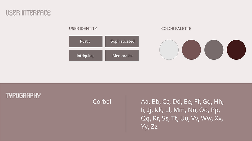
The web design creates a streamlined experience where users are greeted with a clean & rustic design that presents the skillful wood work to new residential and commercial clients. Content was logically organized in order to better understand the services at first glance and the landing page required a synthesized description of the millworking process
Duration: 4 months
Methods: Surveys Interviews, Card Sorting, Affinity Mapping, Preference Test, Wireframing & Prototyping.
Tools: Figma, Optimal Sort, UsabilityHub
Context
I was tasked with providing a rustic, but sophisticated desktop design that would provide a more streamlined experience for potential residential or commercial clients to review previous work and book Grounded Fauna with ease.
The Process
Research
Define
Ideate
Prototype
Iterate
Research
In the competitor analysis, I observed many sites utilizing a call to action button for the contact page to directly route to the phone number. After speaking with the partner, he agreed this would be a useful function as his previous website included the phone number written on the screen.
Competitors were also using more 'cliche' logos such as an image of a log alongside the title. Instead, I used a clean abstract image to provide the sophisticated motif to ensure a more broad client base and appeal to younger home buyers as the area has many tech companies entering the area with a younger clients needing new homes and more commercial companies (hotels, restaurants) requiring Grounded Fauna's services.
Competitor Analysis
Surveys & interviews
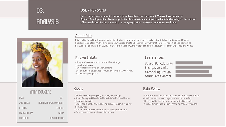
With the goal of understanding millworking clients, I surveyed 15 users of previous clients to review both the old website and new design. I also surveyed 15 users who are currently employed by the company to have perspective from well versed practitioners of woodworking. The overall goal was to ensure the desktop was accessible and equitable for new clients and practitioners in the industry, as I am not as well versed with millworking.


Define
Problem Statement
Potential clients of Grounded Fauna need a synthesized and cohesive platform because they need relevant a webpage that cohesively demonstrates woodworking designs that fit their vision and aesthetic.


Ideate
Low Fidelity Wireframe
Since simplicity and ease of use are the biggest priority for the functionality of Grounded Fauna, I decided to keep the number of screens to a minimum and to ensure primary display had spacing for the three step design process for the woodworking process.
Test
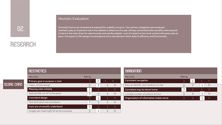
By conducting usability tests, I was able to refine what users were finding useful and alter features that were not working.
In many cases, the users found the navigation proved easy to understand. The users did, however find the text and icons to be too small. Users also found the landing page to require more imagery vs. text.

Iterate
I made changes based on the feedback provided to include edits that capture Gestalt's principals to ensure hierarchy was captured well. In the usability testing, users were not very certain about next steps once reviewing the products and services. To aide in clear direction for the user, I added changes to a call to action button as well as a live chat feature to assist in walking the user through the overall process. Again, playing on the synthesized and cohesive platform.
After reviewing several variations of the webpage, the combination of features and elements that worked best included more monotone coloring and larger/bold fonts for any calls to action. After the third iteration, I noticed users spent the most time reviewing the landing page and photo section, so the final version included a very simplistic photo gallery which we turned into hover pages to inform users of more details surrounding that particular project. I also included imagery at the top of the page to indicate which projects were most relevant.
To view a presentation of the low fidelity prototype, please click here
Final Product
After many tests and iterations, my final product aligned with the main objectives presented; which includes the necessary call to action for users to better understand the overall process and to provide insight into previous projects.